
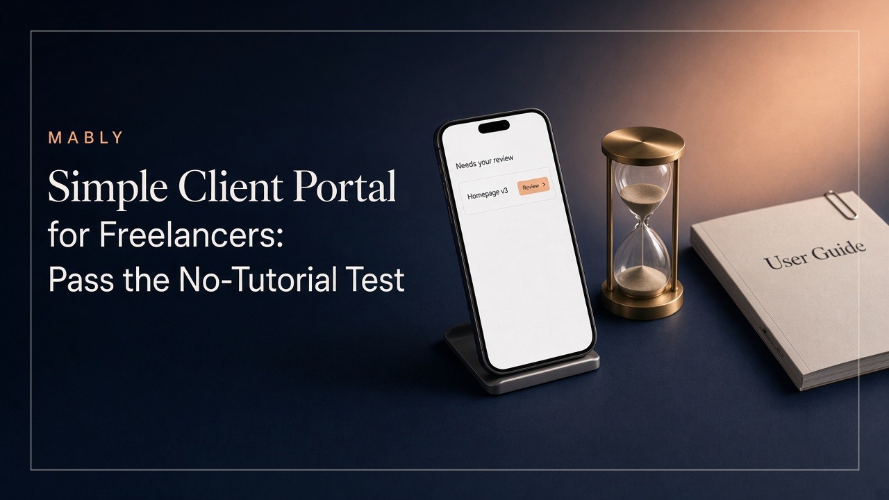
You've set up the perfect client portal. Folders for every phase, a status tracker, a feedback section, an invoices page. It took an afternoon and it looks great.
So you record a quick Loom to walk your new client through it. "Just so you know where everything is."
The Loom ends up being six minutes and forty seconds long.
Your client watches the first ninety seconds. Maybe. A week later they email you asking where to leave feedback on the logo.
Here's the uncomfortable part: if a client portal needs a tutorial, the tutorial isn't the fix. It's the symptom.
This article is about what a simple client portal for freelancers actually looks like, why "easy to use" is too low a bar, and a five-second test you can run today to find out whether yours passes.
"Easy to use" isn't the standard. "Needs no explanation" is
Every client portal claims to be easy to use. The problem is that "easy" usually means easy once you've learned it. Easy for someone who opens it every day.
Your client isn't that person. For a client-facing tool, the standard should be higher: they should understand it the first time they open it, with nobody explaining anything.
That sounds strict, but it's the same standard you already apply to most things clients touch. You wouldn't send a proposal that needed a walkthrough video, or an invoice with instructions for how to read it. The portal is part of the same experience. It should work the same way.
Why freelancers tolerate complexity that clients won't
Freelancers are, as a group, remarkably good at learning software. We live in Figma, Notion, Webflow, Trello and a dozen other tools with deep menus and keyboard shortcuts. Learning a new interface is just part of the job.
That's exactly what makes us bad judges of what's simple.
When you build or choose a client portal, you're looking at it with the eyes of someone who understands every section, because you set them all up. Of course "Deliverables" is where the files are. Of course "Pending" means waiting on the client. It's obvious. To you.
Your client, meanwhile, might be a restaurant owner, a dentist or a marketing manager with forty unread emails. They're not bad with technology. They just don't want to learn a system to see a logo.
Your client visits six times. You visit sixty
Think about how often each of you actually opens the portal over a typical project.
You're in there constantly: uploading files, checking comments, updating statuses. Sixty visits over a couple of months wouldn't be unusual.
Your client might open it six times. Once at the start, a few times when you tell them something is ready, once at handover. And there are usually weeks between visits.
That changes everything about how the portal needs to work:
- They never build muscle memory. Every visit is basically a first visit.
- They arrive with one question. Usually "what do you need from me?" or "where's the file?"
- They leave the moment it's answered, or the moment it gets confusing.
A tool for sixty visits can reward learning. A tool for six visits has to be obvious every single time.
The five-second test for a simple client portal
UX researchers have used a version of this for years, and it works just as well for a freelance client portal. You don't need any special software.
- Open your client portal as a client would see it, with a real project in it.
- Show it to someone who hasn't seen it before and knows nothing about the project. A friend, your partner, a neighbour.
- Give them five seconds. Then hide the screen.
- Ask two questions: "What needs your attention?" and "Where would you find the latest file?"
If they can answer both, your portal is in good shape. If they say "um, I'm not sure, there was a lot going on," you've found your problem, and it wasn't the client.
It's a humbling test. Most portals built from folders and databases fail it, because what's visible in the first five seconds is structure (sections, tabs, menus) rather than answers.
The fix is usually about removing things, not adding them.
Organise around client questions, not your file structure
The most common reason a client portal feels complicated is that it's organised the way the freelancer thinks, not the way the client thinks.
Freelancer structure tends to look like this: Phase 1, Phase 2, Assets, Drafts, Final, Admin, Invoices, Misc.
Client questions look like this:
- What's new since I last looked?
- Is anything waiting on me?
- Where's the latest version?
- What have I already signed off?
- Have I paid for this?
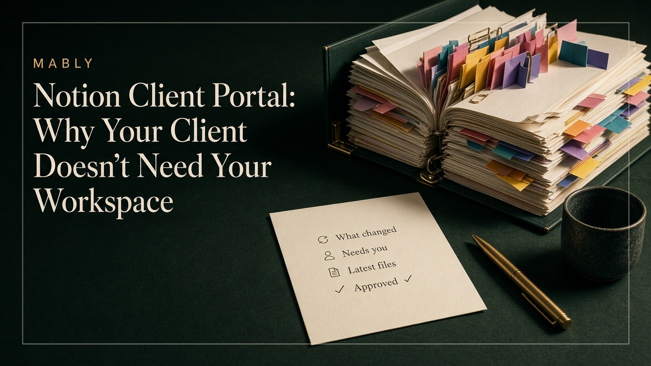
The more your portal's first screen answers those questions directly, the less anyone has to explain. That's also why dropping clients into your internal tools rarely works. We've written about that in more detail for Notion workspaces and for project management tools like Asana, Trello and ClickUp.
A few small language changes make a surprising difference too:
- "Needs your review" instead of "Pending"
- "Approved" instead of "Closed" or "Done"
- "Latest version" instead of a filename like homepage_FINAL_v3_revised.pdf
- "Invoice paid" instead of "Status: Settled"
Write labels the way you'd say them to the client out loud.
Signing in is part of the experience too
Freelancers often forget this step because they're always logged in. Clients aren't.
The most beautiful portal in the world is useless if the client gets stuck at the door. And the door is where a lot of them give up: a forgotten password, a sign-up form, a verification email that went to spam, an app they're told to download.
There are roughly three ways client portals handle access, each with a trade-off:
- No login at all, just a shared link. The easiest for clients, but anyone who gets hold of the link can see everything. Fine for low-stakes work, risky for anything confidential.
- A username and password. Secure enough, but it's one more password for a client who opens the portal six times. Expect "I can't get in" emails.
- A magic link or email code. The client enters their email and gets a link or short code to sign in. No password to remember, and it's still tied to their email address.
For most freelance work, the third option is the sweet spot. It's about as easy as a shared link, without handing access to anyone who finds the URL.
And remember that the real front door is usually an email notification, not the portal's homepage. "Your homepage design is ready for review" with one clear button will get more clicks than any dashboard.
What deserves to be visible (and what doesn't)
Simplicity isn't about having fewer features. It's about showing the client only what helps them make a decision or find something.
Worth showing clients:
- The latest version of each deliverable
- What changed since their last visit
- Anything that needs their feedback or approval, clearly separated
- A record of what's been approved
- Invoice status next to the work it covers
- The handful of links they keep asking for, like the Figma file or staging site
Better kept out of their way:
- Internal notes and drafts you're not ready to share
- Every old revision, front and centre (keep them findable, not prominent)
- Your task lists, time tracking and internal deadlines
- Empty sections "for later" that make the portal look unfinished
- Settings, options and features the client will never use
A useful question for every element on the page: would the client notice if this disappeared? If the answer is no, it's probably making the portal harder to read.
How we think about this at Mably
One of our constraints while building Mably is simple: a freelancer shouldn't need an onboarding call just to explain the portal.
Clients open one branded link and land in a workspace built around what they came to find: what changed, what needs their review, where the files are, what's been approved and where things stand with invoices. They sign in with a magic link or an email code, so there's no password to create and no app to install. You can invite other people from their team too, and each of them gets the same simple view.
If you're still deciding whether you need a portal at all, our guide to client portals for freelancers covers the bigger picture.
Delete the tutorial and test again
Here's a slightly uncomfortable exercise. Take whatever you currently send clients to explain your portal, whether that's a Loom, a PDF, a "how to use this page" section or a paragraph in your welcome email. Then imagine you're not allowed to send it anymore.
What would you have to change for a client to manage without it?
- Maybe the first screen needs to say what's waiting for them.
- Maybe three sections should become one.
- Maybe the labels need to be written in plain English.
- Maybe signing in needs to stop involving a password.
Make those changes, then run the five-second test again. When someone who's never seen the project can tell you what needs their attention after five seconds, you can delete the tutorial for real.
A short welcome message is still a nice touch. "Hi Sarah, this is where everything for your rebrand will live" is friendly, not a tutorial. (If you want a fuller checklist for the first week of a project, our client onboarding process walks through it.) The line to watch for is when the welcome message starts including instructions.
The best client portal is the one your client never has to think about. They open the link, find what they came for and get back to their day. That's not a lack of features. That's the whole point.
A client portal your clients understand on day one.
No passwords, no tutorials. Clients open one link and see what needs them.
Try Mably freeFAQ
What makes a client portal simple to use?
A simple client portal answers the client's main questions on the first screen: what's new, what needs their attention, where the latest files are and what's been approved. It uses plain-language labels, keeps internal details out of view, works well on a phone and lets clients sign in without creating a password.
Do clients need to log in to a client portal?
It depends on the portal. Some use a shared link with no login, which is easy but means anyone with the link can see the project. Others use passwords, which add friction for occasional visitors. Many freelancers prefer magic-link or email-code sign-in, which is nearly as easy as a shared link but still ties access to the client's email address.
Should I record a walkthrough video for my client portal?
A short welcome message is helpful, but if clients need a video to find their way around, the portal is probably too complicated. Try the five-second test instead: show the portal to someone unfamiliar with the project for five seconds and ask what needs their attention. If they can't say, simplify the first screen before recording anything.
What should a simple client portal for freelancers include?
At minimum: the latest version of each deliverable, a clear list of anything that needs the client's review or approval, a record of past approvals, recent updates, invoice status and quick links to things like Figma files or staging sites. Anything the client doesn't need to act on can stay in your internal tools.
How can I test whether my client portal is easy to use?
Run a five-second test. Show your portal to someone who hasn't seen it, hide it after five seconds and ask "What needs your attention?" and "Where would you find the latest file?" If they struggle, focus on making the first screen answer those two questions before adding anything else.
Can clients use a client portal on their phone?
They should be able to, because many clients check in from their phone between meetings. Test your portal on a small screen, make sure the most important actions (viewing a file, leaving feedback, approving work) are easy to reach, and avoid layouts that rely on wide tables or deeply nested sections.
.webp)